Watching a Trend Develop

April 22, 2022

Trading with Microsoft Excel spreadsheets (and eSignal intraday tabular price data).

Since we use 35 minute price data (Open, High, Low, Close), we are usually on top of the movement  and development of medium and short trends.   But, price changes can surprise and catch a trader who is off guard and not paying attention.

So, pay attention to your Microsoft Excel spreadsheet charts as you add prices during the trading day.

Here is the Emini S&P June 2022 contract as of mid-day:

4-22-2022 blog post

Explanation of the above chart:

Yellow dots are end-of-day markers.  Green dots are bullish momentum dots.  Gray dots are neutral momentum dots.  Red dots are bearish momentum dots.

Blue line is the blue Bill Williams Alligator line.  This is the 13 bar s.m.a. of the close, then smoothed by 8.

Red Line is the 29 bar s.m.a.  of the close.  This is our primary trend direction tool.

Using 35 minute price data.

Good luck to your trading!

USE VAMI for comparing systems

December 22, 2021

Excel and trading, (free MS Excel template is available BELOW).

VALUE ADDED MONTHLY INDEX (VAMI) (When to Use it?):   When you have different trading systems and you want to compare their performance, or if you have different versions of one system and you want to compare them, it is useful to normalize the monthly returns and then compare them with VAMI calculations.   Or, you can compare your results on a monthly basis with the performance of the emini S&P (or any other tradeable).

This way, when you are finished, you can compare apples to apples, rather than apples to oranges.   With VAMI results you can evaluate the 2 sets of performance results.

Here is an example that compares the S&P to a hypothetical trading system:

Which has performed better?


VAMI 1 pic

Here is the excel demonstration file for download (no VBA, no macros).

VAMI with formulas     <—DOWNLOAD HERE

Remember, there are many other ways to compare trading system results, such as cumulative equity comparisons,  Sharpe ratio comparisons, Gain-To-Pain ratios comparison, Tharpe system performance metrics, etc., etc.

Using VAMI is a good place to start, and so here are the calculations in Excel.

Good luck with your trading!

therivertradingsystem@gmail.com

Excel Trading System using End of Day Price Data

Trading With Excel spreadsheet and eSignal price data.  

December 18, 2021 

To show educationally How you might use Excel spreadsheet to calculate entry targets, losses and gains, including stop loss exits, and profit exits, monthly P/(L), and much, much more!

eminiways.com

Method:  Using two (2) simple moving averages and R.S.I. as a filter. 

Purpose: To show educationally How you might use Excel to calculate entry targets, losses and gains, including stop loss exits, and profit exits, monthly P/(L), and much, much more!  All Formulas are shown and A TEMPLATE (COMPLETE TRADING SYSTEM) IS INCLUDED FOR YOUR STUDY AND EDUCATION only).


image

BONUS !  !  BONUS!  !   Swing Line chart and calculations for making a swing line chart with Excel included ! ! 

image


HERE IS THE DOWNLOAD of THE MS EXCEL Spreadsheet (no VBA, no macros):

contact us at:

therivertradingsystem@gmail.com

What is the E-Mini Trend Today?

Trading with Microsoft Excel (Using 35 minute data or 12 bars a day).

End of Day January 7, 2022

The Daryl Guppy Multiple Moving Averages (GMMAs) give us a first look at the trend today.

GMMA jan 7 2022

At the far right above, the red dots (downward momentum) are BELOW the blue lines and BELOW the red lines, meaning an DOWNWARD TREND.

BELOW:  Another example of a trend indicator that we use is the 29 bar s.m.a. of the close (red line below) .  The second red line is the same moving average but smoothed.

The Army Green below is the Halfway Line (half way between the 3 day High and the 3 day Low).   It is shown with the 29 period s.m.a. of the close and its smoothed self both as red lines.  The Halfway line is an excellent trend indicator, and is a good trade signal as well.  We use it along with the 2 red lines as enhanced trend indication!

halfway Jan 7, 2022

Lastly, we present (below) a bit more complicated chart, which uses EMA Waves (exponential moving averages of the High, Low, and Close).  We use the 29 period e.m.a. of the High, Low and Close as our default.  (Raghee Horner, who originated these, uses the 34 e.m.a. of the High, Low, and Close.)

Please see our POST about the EMA Wave (with free Excel download) in the archives.

EMA wave Jan 7, 2022

Please see our Post about EMA Waves in our Archives.   There is a free download of a macro-free, no VBA Excel Spreadsheet available also.

SO, WHAT IS THE EMINI  TREND TODAY?

CONCLUSION: the trend is DOWN at the end of the Day, January 7, 2022.

As you can see, we have found that using Microsoft Excel is accurate, fun, and profitable!   We hope you enjoy our colorful charts, which make VISUAL TRADING so much easier.

Good luck with your trading!

contact us at:

therivertradingsystem@gmail.com

EMA waves and Excel spreadsheet

Using Microsoft Excel to Visualize Price Patterns


Simple Trading With Excel. 

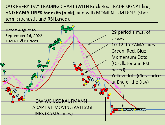
Here is a LINE CHART with 29 period EMA bands.   We show 35 minute price data, with 29 EMA of High (green line), 29 EMA of Close (blue line), 29 EMA of Low (red line).  Note: with the Excel file, you can change the EMA period if you wish, and the price data of course, and also change the colors it you wish (in your own Excel file which you can DOWNLOAD below at the bottom of the page.)

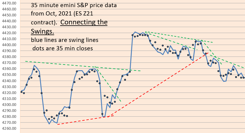
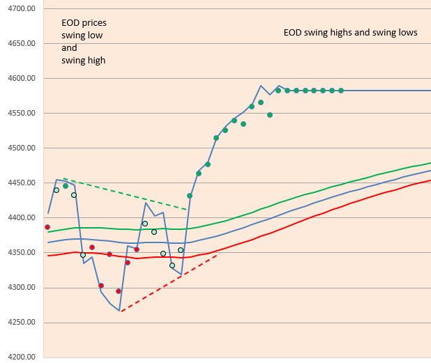
35 minute Emini S&P price data shown in all charts, for the December 2021 contract.

image

HOW TO MAKE THE ABOVE CHART MORE USEFUL FOR TRADING? 

FIRST, CONVERT EACH PRICE POINT (the 35 minute closing prices) INTO A COLOR DOT, BASED UPON above the EMA lines, below the EMA lines, or between the EMA lines.   Here are the color dots, green, red, blue:

image

AND see below, put it all together and THIS  IS WHAT A CHART LOOKS LIKE WITH THE COLOR DOTS AND THE EMA WAVE lines:   Much better and easier to use, we think!

image

Note how green dots are ABOVE the EMA wave, red dots are BELOW the EMA wave, and blue dots are BETWEEN the EMA wave lines?

As an example of a simple trading strategy, you could Trade Long with green dots, Trade Short with red dots, and be Neutral or OUT with blue dots.

on next line- EMA waves Excel file below for download- click on “29 bar EMA waves” below (no macros, and no VBA code)

29 bar EMA waves                   

(DOWNLOAD is above)

Note: the original ideas for the EMA waves come from Raghee Horner in her book on Forex trading ( 1997 ?) .     She prefers to use the 34 bar EMA wave, and instead of dots she prefers to use Candle Stick bars with distinctive colors (red, blue, green).   Since we are not able to do the same thing with Microsoft Excel spreadsheets, this is our solution for the time being.   The key attribute of either method is better VISIBILITY/ VISUALIZATION of trends.       

Good luck with your trading!

Please view our archives for a wide variety of Excel related and trading related information.

therivertradingsystem@gmail.com

Example of an Excel Trading System

Using 35 Minute Price Data (12 bars a day)

Trading With Excel

Here is an example of how to trade with Excel, over 3+ years. Please remember all trading implies risk and monetary losses, so use the following template with caution. All traders must trade with adequate starting capital and be sure to use strict loss controls and strict and conservative sizing rules. This excel approach represents a possible approach, but does not propose to be complete or finished or exemplary in any way.

DO YOU WANT TO SEE AN EXCEL BACK-TESTING SYSTEM?

Here is a simple and non-complicated Microsoft Excel Trading System, which uses 35 minute price data for 2018, 2019, 2020, and most of 2021. Results are hypothetical and this system is presented for educational purposes only (no trading recommendations or advice is given). We offer it as a starting point for hypothesis, analysis, investigation, and statistical experimentation only, not as a completed product.

The system uses calculations for Directional Movement, developed by Welles Wilder, and the logic is explained in his book: New Concepts in Technical Trading systems.

One of the reasons for good performance is the long term bullish trend. We doubt that it would work so well in a 3-4 year ranging market with no long term trend.

(NO macros, NO VBA in the Excel spreadsheet download)

Also, please see in the archives our related post which is entitled:

“Excel Trading System Using End Of Day Price Data”

Good Luck with your trading!

Contact us at:

therivertradingsystem@gmail.com

Using the Halfway Line (between the Dips and Rallies)

Simple Trading With Excel.

This technical indicator (shown in GREEN below) is based upon recent dips in prices and/or recent rallies in prices.   It is the halfway line between the 3 day high price line (not shown) and the 3 day low price line (not shown).  A 29 bar s.m.a. of closes is shown, and a smoothed 29 bar s.m.a. of closes is shown along side the GREEN line.  They look like this:

D and R Line

Chart above is from mid-September 2021 to mid-October 2021 (35 minute Closes).

We use it to CONFIRM the Trend Direction.   Prices below all 3 lines are trending SHORT.  And prices above all three lines are trending LONG.   If prices are between the moving averages and the GREEN LINE, then this is a neutral area.

Try it.   Good luck with your trading!

contact us at:

therivertradingsystem@gmail.com

Create a Swing Line chart

Trading with 35 minute price data, and Microsoft Excel

Since we are long term followers of Ira Epstein in Chicago, we thought we’d try to invent a swing line chart similar to his.

Using Excel, we have done this, and although there may be minor differences, we like these calculations so much that we have started incorporating them in our end-of-day analysis of price action.

Connect the Swing Lines To See Price Action

If you wish to see how this is done in Excel, download our “example of trading system with swingline chart” in the archives.

See archives for excel demonstration of Swing Line calculations.

You can apply this to Daily Prices as well (end of day prices) with your Excel spreadsheet (see below):

End-of-Day prices with Swing Highs and Swing Lows- Oct 29, 2021

see our ARCHIVES for the post on EMA Waves (the green, blue, red lines above).

here’s the link:

https://eminiways.com/2021/10/19/ema-waves-and-grab-dots/

contact us at:

therivertradingsystem@gmail.com

Use the KAMA (Excel spreadsheet for download)

Trading with Microsoft Excel (spreadsheet available below)

WHY you might USE THE KAMA (Kaufman’s Adaptive Moving Average)

Among the many trading entry signals, for long or short positions, there is the ever present variety of moving averages, simple, exponential, volume-weighted, doubled, tripled, and adaptive or variable. Which to use?

Trade the emini-S&P in any way you like, trend follower, swing trader, breakout trader, whatever, but WE have found that we like short term to medium term trading, so that we can have a monthly income (!) with approximately 10 trades a month, and 60% win rate, and thus we can fight against either the aggressive tension or the bountiful boredom (whichever the market offers us) by trading successfully and artfully.  We will drop clues like Hansel and Gretel little by little as we continue our discussion.

Let us offer the following:  1) you must slow down the data stream and yet keep the rhythms visible, because those rhythms, those ups and downs are tradeable.   CONCLUSION: no EOD data for us.   We use 35 minute price data.

“Patience gives you choices.   Choices give you power.”

2) you must also concede that predicting the direction of the market is a fool’s errand.   No matter how excellent your Elliott analysis is.   No matter how decisive your double e.m.a. system is, you CAN NOT predict the direction of the market (especially if you WANT to see the ups and downs and LIKE to follow the rhythms of the prices in order to make a living).   End of Day data takes away all the ups and downs of the short-term fighting market forces.  Therefore, we FOLLOW the market, by using a short term to medium term system (using intra-day price data and a short term moving average as a directional indicator).

3) First, use Kaufman’s Adaptive Moving Average (KAMA) to slow down your moving average lines and to also hug the prices closely and with adaptability.   It is adaptable.   It adjusts.   (KAMA Setting is 10-2-30 which is standard.)

4) Second, take a 24-29 bar simple moving average (s.m.a.) of the above KAMA and let that be your Directional Signal/ Indicator.

KAMA DOWNLOAD IS BELOW (just below this):…….. (no macros, no VBA)

download excel file here:  (no macros, no VBA)  

That’s all for now, folks!

contact us at:

therivertradingsystem@gmail.com

Risk of Ruin Calculations

How Good is your trading strategy? Find out what your probability of “Ruin” is.

(Excel spreadsheet below available for download. No macros, no VBA.)

HERE’S THE FIRST WAY (which does NOT rely upon win % to calculate).

David E. Chamness had an article in Futures magazine (August 2009) entitled, “Minimizing Your Risk of Ruin”, and his formulas are independent of win%.

We will plug in our values….

  1. Percent of the account that we are willing to lose and define as “ruin”,  (let us say 50%).  Some folks prefer to use 30% as their definition of ruin.

2. The Average of all our Monthly Returns (gains and losses) in percent,  say 7.68%.

3. The Standard Deviation of all our Monthly Returns (gains and losses) in percent, say 11.6%.

Excel Formula:   EXP((-2*(Average of Monthly Returns)*Percent of the account that we are willing to lose and define as “ruin”)/(Standard Deviation of Monthly Returns*Standard Deviation of Monthly Returns))

example with values from above entered:   EXP((-2*(.0768)*0.50) / (0.116 * 0.116)) =  0.34% RISK OF RUIN

HERE’S ANOTHER WAY TO CALCULATE RISK OF RUIN using other trade data:

Nauzer J. Balsara’s text, Money Management Strategies for Futures Traders, (John Wiley, 1992) presents a widely respected formula.

And Brent Penfold’s book, The Universal Principles of Successful Trading, presents the same formula very well.

The  Equation: ((1-(%Win-%Losses))/(1+(%Wins-%Losses)))^(RiskCapital/Max Loss).   This formula is easily plugged into Excel.

Example:  Assuming  %Win = .59   and    %Losses = (1-.62) = 0.41,  Risk Capital = $50,000,        Max Loss = Historic Max Loss To Date = $6,050

 Equation:    ((1- (.59 – .41)) /      (1+ (.59 – .41)))^(50,000/6,050)

                  = 4.94%   RISK OF RUIN

DOWNLOAD EXCEL EXAMPLE: (NO VBA, NO MACROS) here……………

contact us at:

therivertradingsystem@gmail.com