Shade An Area Between 2 Lines

 Trading With Microsoft Excel Spreadsheets

imageimage

HOW TO CREATE A SIMILAR CHART WITH MICROSOFT EXCEL,  

1. Go online and follow the many directed instruction sites which will show you and tell you how to construct it.

If you are curious, you can Google “How To Shade An Area Between 2 Lines in Excel” and if you do so, you will receive many many web sites that will help you do this.

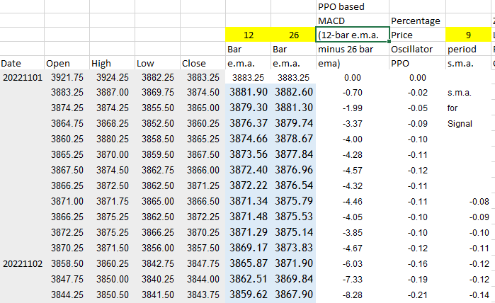
2. Or, the easy way, use our example Excel spreadsheet to get started.  Simply  download the Excel spreadsheet at the bottom of the page and then plug in your own price data, calculation data , etc.  (NO VBA, and NO MACROS involved).

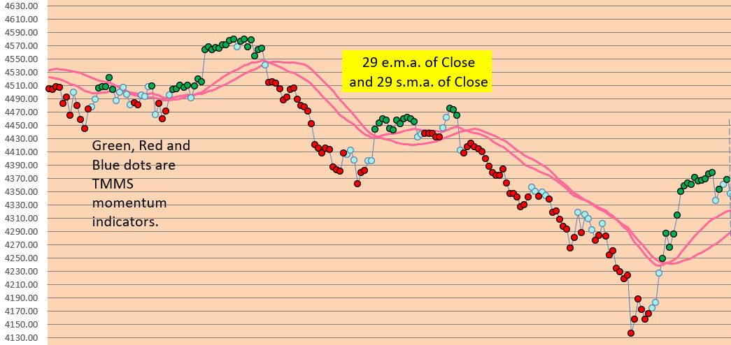
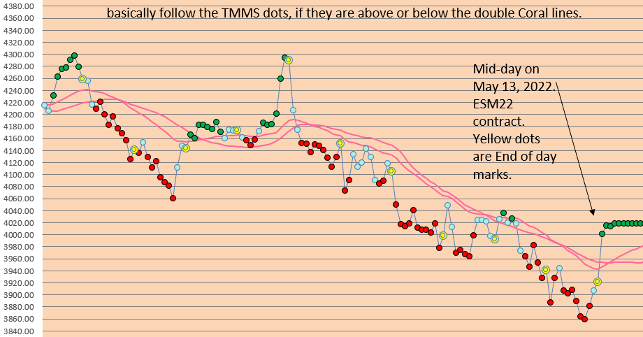
As Excel based traders, we rely on visual charts made with Excel for our trading decisions, our entries and exits.   The better we can visualize the areas of Trend Breakout or momentum, either up or down, then the better we can execute trades and take advantage of sustained price moves, whether they be intraday or longer term. 

For example, we may use a couple of moving averages to signify a “No Trade Zone” vs a “Yes Trade Zone”, which are essentially PERMISSION BOUNDARIES. 

Or we may use particular Ichimoku Lines to show us where we need to exit trades to prevent losses or lock in a profitable trade.  

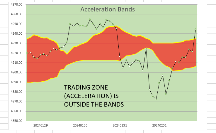
Or we may use a couple of Acceleration Band Lines to demonstrate a boundary between ordinary price movement and accelerated price movement.   These are just our uses and yours may be variable as well. 

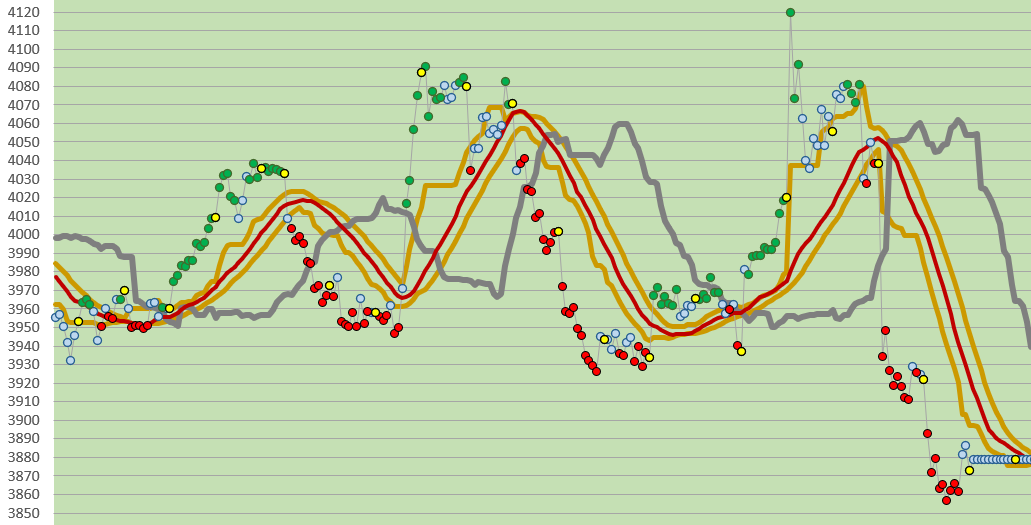
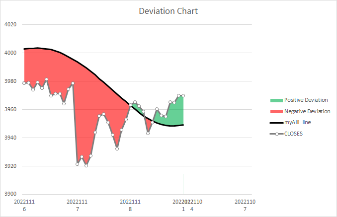
Here is an example of ACCELERATION BANDS with shading (using 35 minute price data, this represents 4-5 days activity):

Accel Bands for Blog

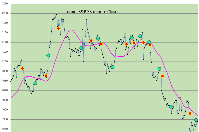
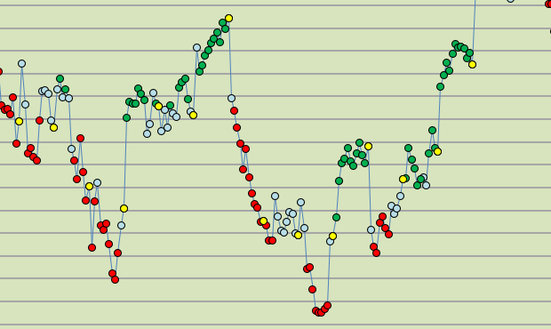
Here is a regular Excel Chart (not shaded).:  (Since we use 35 minute bars, or 12 bars a day,  this represents 5-6 days of Price Activiity.)

image

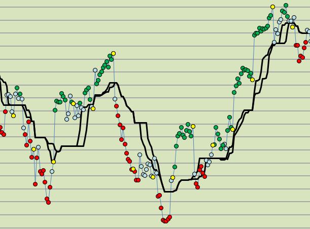
And here is a Shaded Area Excel Chart, (using the same price data as above) which highlights the “No Trade Zone” (which is a neutral or “out” area). These are essentially Permission Boundaries.  The Shading assists with Profit taking and helps avoid foolish trades, and excess trade losses when prices move against you.   THE SHADED AREA IS A “no permission” type boundary zone.

image

All of your charts can be visually accentuated and highlighted in your Excel spreadsheet if you know how to shade an area between 2 Lines.  (And of course, you can even shade more than one area and between more than 2 lines if you wish to pursue that end also.) 

Here is the Excel Spreadsheet to Download: (no macros and no VBA):

Updated version Feb 4, 2024 has a new example worksheet.

Good Luck With Your Trading!

contact us at therivertradingsystem@gmail.com

Excel Weighted Moving Average and Center of Gravity Oscillator

May 14, 2024

Excel Weighted Moving Average and Ehlers Center of Gravity Oscillator

Trading with Excel Spreadsheets—or Useful Excel Calculations for Trading Analysis

We have been perusing some of the offerings that John Ehlers has given all of us, in his books, and his many article on Technical Analysis from his perspective as an Engineer.

One tool in particular, the Center of Gravity Oscillator, demonstrates how you can calculate a Balance Point in a series of Closing Prices, and that this may be useful for giving trading signals if you wish to do that.   If you download and read his PDF document you can get a sense of his purpose and his mathematics.

Center of Gravity Oscillator picture

Here is the PDF document that is widely and freely available on the internet, which describes the “Center of Gravity” Indicator or Oscillator.

https://mesasoftware.com/papers/TheCGOscillator.pdf

The calculations involve the creation of a Weighted Moving Average, which we thought would be helpful to know how to create in an Excel Spreadsheet.

WMA picture

The Brown Line above is the weighted moving average (WMA). 

How to Create a Weighted Moving Average (WMA) with Excel:

A description of a Weighted Moving Average (WMA) is given at this web site.

https://www.spreadsheetweb.com/how-to-calculate-weighted-moving-average-in-excel/

A weighted moving average (WMA) is designed to put more weight on recent price data and less weight on past price data.  A WMA is calculated by multiplying each of the previous bar’s data by a weighting factor.  The weighing factor is based on the number of bars in the selection at hand.

OUR EXCEL EXAMPLE below MAKES IT SO MUCH SIMPLER, AND MUCH EASIER, and the weighted moving average is automatically adjustable with just the use of one cell reference.  You can choose whatever measure of w.m.a. that you want ( 3, 10, or 21, or 50 or whatever number you choose to use).

DOWNLOAD A FREE EXCEL SPREADSHEET BELOW (with Weighted Moving Average and Ehlers’ Center of Gravity Oscillator)

We will provide you with an Excel Spreadsheet example below that you may download to explore more fully.

1. shows the automated and adjustable calculations for Weighted Moving Average
2. shows the automated and adjustable calculations for Exponential Moving Average
3. shows automated and adjustable calculations for Simple Moving Average
4. Shows how to create the Center of Gravity Oscillator and demonstrates
the Center of Gravity Trade Signals.

From our Excel Spreadsheet:  The Weighted Moving Average and the C  O G Oscillator (Center of Gravity Oscillator)SIGNALS shown here in A CHART:

WMA and C O G Signals (2)

Good luck with your trading!    Thanks!

THE DEFAULT CONTROL VALUE THAT EHLERS ASSIGNS TO THE WMA (FOR THE C.O.G. calculations) IS TEN (10).    YOU MAY WISH TO ADJUST THE CONTROL VALUE ON THE SPREADSHEET TO THE VALUE OF 10 TO SEE THE ORIGINAL APPLICATION AT WORK.

NOTE:   We find that other values are more useful for our 35 Minute Price Data TIME FRAME.   

Back Testing With Percentage Price Oscillator

March 6, 2023

Back Testing With Different PPO Settings (Percentage Price Oscillator Settings).

Using Microsoft Excel for Trading

The PPO, or Percentage Price Oscillator is a Momentum Oscillator, which compares one moving average to another and calculates values that are similar to the MACD (Moving Average Convergence/Divergence indicator).

The values obtained are percentages, which makes it useful for comparing different types of markets.   We are using the emini-S&P 35 minute prices (12 bars a day) for our calculations.

Formula and Calculation for the Percentage Price Oscillator (PPO)

Use the following formula to calculate the relationship between two moving averages for a holding.

PPO=(12-period EMA−26-period EMA26-period EMA) ×100.

Signal Line=9-period EMA of PPO.

PPO Histogram= PPO−Signal Line.

  1. Calculate the 12-period EMA of the asset’s price.
  2. Calculate the 26-period EMA of the asset’s price.
  3. Apply these to the PPO formula:     
  4. PPO line: (12-bar EMA – 26-bar EMA) / 26-bar EMA * 100 to get the current PPO value.
  5. Once you have at least nine PPO values, make the signal line by calculating the nine-period S.M.A. or EMA of the PPO Line.
  6. Use the Crossover of the Signal Line and the PPO Line for your “go LONG” or “go SHORT” activity on your Excel Worsheet and Chart.

Here is a SNIPPET (Clipping) from a section of our downloadable spreadsheet which you can get at the bottom of this blog post:

PPO fifth

WE USE THE CROSSOVER OF THE PPO Calculation with the SIGNAL LINE TO SIGNAL “LONG” or “SHORT” ENTRIES.   Some traders like to use the zero line for signals, but we do not.

PPO third

FROM THE SPREADSHEET:  Here is what a longer term chart looks like:  (Red dots mean “Go Short”, and Green Dots mean “Go Long”……A 29 period simple moving average of the Close is included.

PPO fourth

IN THE FREE SPREADSHEET (DOWNLOAD BELOW): 

WE COMPARE FOUR (4) DIFFERENT SETTINGS FOR THE PPO (Percentage Price Oscillator) Calculations, and show FOUR (4) DIFFERENT CHARTS.   One Setting is particularly good, and it is very near to the standard values of 12 and 26 as settings. 

REMEMBER, WHATEVER RESULTS SHOW UP DURING THIS TESTING PERIOD MAY NOT BE AN INDICATION OF SIMILAR RESULTS FROM EARLIER TESTING PERIODS OR FUTURE TESTING PERIODS.  THERE IS RISK IN ASSUMING THAT THIS STRATEGY IS RELIABLE OR PROFITABLE BASED UPON THIS SHORT TIME PERIOD IN THE SPREADSHEET.   USE IT FOR EDUCATIONAL PURPOSES ONLY.

YOU CAN SEE WHERE on a chart THE TRADES ARE INDICATED (By the  bright Green or bright Red Dots (not the same thing as Trend Strength Dots)). 

WE ALSO INCLUDE A TRADE Analysis AND PROFIT/ (LOSS) ANALYSIS FOR EACH SETTING, so that you may evaluate the Performance Statistics of each PPO MACD setting.

ALL PPO MACD SETTINGS ARE ADJUSTABLE.     ALL STARTING EQUITY SETTINGS ARE ADJUSTABLE. 

Here is a snippet of what an typical report includes:    

PPO first

Spreadsheet also includes Trade by Trade results, Like this:


PPO second

Please Note:  THE TRADING STRATEGY IS A LONG OR SHORT REVERSAL STRATEGY, WITH NO STOPS, NO EXITS, AND SERVES AS A BEGINNING SPREADSHEET FOR THOSE WHO ARE INTERESTED IN ANALYSIS, STATISTICS, AND TRADING PERFORMANCE SET UP.

We hope that you find Back Testing W Percentage Price Oscillator (PPO) useful, and can include it in your took kit while trading with Microsoft Excel.

 Good Luck With your Trading!

PPO For Back Testing Download is below.

Excel Spreadsheet DOWNLOAD HERE: 

Not a standard moving average line!

Jan. 15, 2023

Trading With Microsoft Excel Spreadsheets

We have all heard the phrase “The Trend is your friend.”  Or, “follow the Trend”.  And we all know that, as Chick Goslin said so well in his books, “Continuation is more likely than change.”  (Which means that Trends tend to continue longer than we think they will.)

So, which trend do you prefer to trade?   Long Term Trend?   Medium Term Trend?  Or, Short Term Trend?     “Long” or “Medium”, or “Short” mean different time frames to each and every different trader, right?

With our approach, using 35 minute price data on Excel spreadsheets, we have over time been able to finely tune our Trend Trading. And not with moving average lines!

For example, here is a very recent short term chart, showing Our Trend Strength Dots:   Below you can see our chart of  6 days of Trading activity (Jan 6 thru Jan 13, 2023).  The yellow “cross mark” is an End-Of-Day close mark.  There are NO EXITS shown, because the neutral momentum areas are usually very good exit areas (or areas to add-on contracts if the conditions are right).

Green dots are Bullish trend strength.   Red dots are Bearish trend strength.  And blue dots are “neutral” areas of little or no trend inclination.

These red and pink lines are NOT standard moving averages….read on to find out….and see how they can be useful as EXIT signals if wanted.


recent short term

We Trade in a Long direction if the close is above the Red Lines, and use the Pink lines to exit when prices goes down between or below them.   We Trade in a Short direction if price is below the Red Lines, and then use the Pink Lines to Exit when prices reverse up and between or above them.

Explanation of the various Trend Lines (not moving average lines):

RED LINES are the Medium Term Trend demarcation.  Above the red lines is Medium Term Trend LONG.   Below the red lines is Medium Term Trend SHORT.

RED LINES ARE MP17 and the MP21 (using the Ichimoku calculation technique). For the MP17, the calculation is done like this:  You take the Highest High in 17 bars and add it to the Lowest Low in 17 bars.  Then divide by 2.   The results of this  calculation gives you the MP17 red line.   Please note:  This  is not the same as the moving average of median price. And it is certainly not the same as a standard simple moving average (nor a standard exponential moving average).

For the MP21:  You take the Highest High in 21 bars and add it to the Lowest Low in 21 bars, and then divide by 2.   The result gives you the MP21.

THE PINK LINES are the Short Term Trend lines.   Above the Pink Lines is Short Term Trend Long.   Below the pink lines is Short Term Trend Short.

PINK LINES are the MP6 and the MP9 (again, using the Ichimoku calculation technique).  Do exactly as you did with the MP17 and MP21 calculations, but use 6 and 9 as your focus instead of 17 and 21.

These lines have unique properties and reveal the movement of prices much differently than any moving average line.   You may grow to like them as we have!

The Trend Strength dots are Green (Bullish momentum), Blue (Neutral momentum), or Red (Bearish Momentum).   Bright Blue dots signify strong neutral momentum status.

CHOOSE TO  TRADE above and below the Pink Lines for Short Term Trading. This is fast (with new price data each 35 minutes, and subject to occasional whip-sawing of price data).

CHOOSE TO TRADE above and below the RED LINES for Medium Term Trading. This is not so fast, and every once in a while is  subject to whip-sawing of prices. 

Other Lines:  LONG TERM TREND LINES for our style of trading include the MP84 line (for filtering trades according to whether the emini S&P is above or below the MP84 line).  This is not shown in the chart.  You would trade the pink lines or Red Lines based upon whether they were above the MP84 line.  

For us, another good long  term Trend line is the Ichimoku SPAN A line (which is not shown), greatly helping with accuracy of trades, and reducing frequency of losing trades.  

Using Microsoft Excel for technical analysis is profitable!  Try the above mentioned studies with your own Excel spreadsheets!

Good luck with your trading!

ICHIMOKU style trading with Excel Spreadsheet

Trading with Excel Spreadsheets

December 18, 2022

Please note: this is NOT THE SAME AS CLASSICAL ICHIMOKU CHARTS.

Ichi Advice E

Price data in all of these charts is from December 2, 2022 thru December 16, 2022.

We have found this to be quite reliable for trading visually, with reduced risk in trades due to the Gray Line filter, and during the trading session it is visually clear with no confusion as to when to trade and in which direction to trade.

This is a VARIATION on the “style” of Ichimoku Charts, where there is a

1. Price Line which shows Closing Prices.

2. Short term band to show possible exit areas (normally called the Tenkan Sen or Conversion Line).

3 Medium term band to show the Trade Signal (normally called the Kijun Sen or Base Line).

4. Long term band (normally called the “Cloud”), to show long term support and resistance areas, with Span A and Span B, etc.

Please study these Ichimoku related terms on other web sites and with other resources to learn more about this fascinating and VERY EFFECTIVE method of chart construction and trading.

We use different calculations and demonstrate the price action differently from a conventional Ichimoku Chart, but with many of the same instructive and conservative features that Ichimoku has.

In addition, Our VARIATION shows: The short term momentum of the Closing Prices.

Ichi Advice B

Here is how it looks in a chart:

Ichi Advice C

Our VARIATION shows: A Band of 3 lines (gold and brick red lines) which is the TRADE SIGNAL Band.  Above this band the price direction has a tendency to go up.   Below this band, the price direction has a tendency to go down.

Our VARIATION SHOWS: A Gray Line  (this line determines the overall Trend in our chart).  Look to the Gray Line to tell you what the Trend is, and what the Trend has been.   It acts as a Filter:  If Closing price is above this line, then Long Trades are permitted.   If Closing price is below this line, then Short Trades are permitted.

Ichi advice A

Here is another snippet from the larger chart above:

Ichi Advice D

Because of our unique time period (35 minute bars), and our use with Microsoft Excel to create charts, we have changed the Ichimoku conventional chart into a different one.   WE ARE PRESENTING A DIFFERENT TYPE OF CHART, which utilizes the concepts from Ichimoku,  and which suites our needs at this time.   Perhaps you will find it helpful.

Ichie Advice F

Below, is a longer term view of the E-mini S&P chart from Nov 17, 2022 until Dec 16, 2022.  You’ll note how closely the 29 period s.m.a. (brick red line) follows price action:

longer term view

Good Luck with your trading.

Interested in having the spreadsheet?  Contact us and we’ll send you a copy when you give us a small donation!  

therivertradingsystem@gmail.com

What are Trend Strength Dots? They are a measure of momentum.

Trading with the Excel spreadsheet.

November, 2022

Nowadays we can calculate Trend Strength in a variety of ways, with the ADX, a momentum indicator calculation, or a MACD, or with any one or a variety of fast and slow oscillators, with Chande’s momentum oscillator and other methods.

Since we like a VISUAL momentum indicator to be used with our charts, we suggest and recommend the following: create Excel Trend Strength Dots (see charts below).

KNOWING THE STRENGTH OF A TREND IS THE BACKBONE OF ANY TRADING METHOD

Above is a series of 35 minute closes over more than two weeks time. Each dot is a Trend Strength Dot, green for Bullish, Red for Bearish, Blue for neutral. The yellow dots are End-of-Day markers.

THEY HELP YOU EVALUATE DIRECTION AND MOMENTUM.

If you add a moving average of your choice, you may find the trade signals more clearly.

We have added the equivalent of a 17 and 21 bar moving average here so that you may VISUALIZE how you might trade with your Excel Spreadsheet.

We usually exit a directional trade (red or green dots) after the dots have turned blue (because blue dots indicate a neutral trade strength, a pause, or a change in trend). If prices are near the black lines then it is an excellent time to exit.

This is how you can make these dots for yourself in your own spreadsheet: follow these directions.

Start with these steps…..

  1. Calculate a standard 14 period Stochastic Oscillator
  2. Calculate a standard 8 period Stochastic Oscillator.
  3. Calculate a standard RSI (relative strength index).
  4. Combine the data into a price chart and display it as a dot. When all 3 measurements have a value above 50, then the dots will be GREEN. When all 3 measurements have a value below 50, then the dots will be RED. Otherwise, the dots will be light blue (NEUTRAL).

(We hope to show you how to do this in our free No-VBA spreadsheet which you can download below. But it is not available at this time.)

14 bar Stochastic Oscillator which illustrates price momentum.

8 bar Stochastic Oscillator which illustrates price momentum.

If you just construct 3 separate charts (14 period Oscillator, 8 period Oscillator, and RSI), (SEE ABOVE THREE CHARTS), how would you go about using them during a day of trading? Looking at each of them, back and forth, all day? Too difficult to use when you just have a line chart. There is an easier way, and the BEST WAY is to make Colored Momentum Dots (see how they look at the top of this page).

When you make a combined chart (above) which joins all 3 data sets together on a single chart, then you will have a confusing mess of 3 or more different lines, all being displayed above and below their significant reference lines. This is not easy to make use of, is it?

A creative solution is to do the following, make Trend Strength Dots, which COMBINE the two stochastic oscillators data and the RSI data and then display this on a price chart all at the same time in relation to the prices. Confused?

(Above) All three momentum measurements combined into Trend Strength Dots. The Trend Strength above went from Green (bullish), to Blue (neutral), and finally to Red (bearish).

Trend Strength Dots are a very good visual aid while trading each day.

The Trend Strength dots are displayed dots on a chart of the closing prices which are colored green or red or neutral based upon their composite calculated momentum values. For instance, Green (favoring a “bullish” momentum), red when they favor a “bearish” momentum, and neutral (light blue) when they are neither bullish or bearish (“neutral”).

With additional data included, they look like this:

This is how Trend Strength (Momentum Dots) appear within your price charts in Excel spreadsheet.

A much clearer VISUAL picture of what is happening to prices over time.

You can also reference the present momentum status next to your entry prices in your spreadsheet. (Get a read-out of the current price bar’s momentum status.)

For a small donation, there is the demonstration spreadsheet available (no VBA, no macros).

(contact us and make a donation as well, and we will send you the Trend Strength Dots Excel worksheet). THESE MOMENTUM STRENGTH DOTS (Trend Strength) ARE ONE OF THE PILLARS OF OUR TRADING APPROACH!

Good luck with your trading!

therivertradingsystem@gmail.com

Smoothed Heiken Ashi in Excel

September 10, 2022

Trading with Microsoft Excel spreadsheets.

We would all like to use Excel charts to help us trade better, and to help us VISUALIZE the trends in the emini-S&P market.    We find that a smoothed Heiken Ashi Candlestick chart helps us see trends better, but there is a downside as well, which is a trend signal that is just too slow for us to use with 35 minute price data.

Both Heiken Ashi Candlestick charts (normal and smoothed) lag behind the price action as the ordinary Heiken Ashi candlestick chart is based on a 2 bar average calculation, and a smoothed Heiken Ashi candlestick chart lags even more.

But to satisfy your curiosity, we will show how to create them in the Excel spreadsheet (available for download).  No VBA, and no macros.

Just below is an Excel LINE CHART of recent emini-S&P price data (Sept 2, 2022 through Sept. 9, 2022):

Line Chart emini

Here is a normal Heiken Ashi Candlestick chart from the same recent data:

Original HA candlesticks

And here is a smoothed Heiken Ashi chart which uses the same original price data.

double smoothed HA candlesticks

The charts represent price data (Open, High, Low, Close) from  September 2, 2022 through September 9, 2022, using our 35 minute price data (12 bars a day).

Steps to Take With A Spreadsheet to Create Smoothed HA Candlesticks:

1.  Convert ordinary Open, High, Low, Close price data to the Heiken Ashi price data.

Please see the Excel spreadsheet which is available to download below.  (no VBA, and no Macros).  

2. Calculate the 7 or 10 period exponential moving average of the Heiken Ashi Open, the Heiken Ashi High, the Heiken Ashi Low, and the Heiken Ashi Close.  This is the first smoothing step.   (You may use a lower or higher number, rather than 7 or 10, if you wish.)

3.  Calculate the 7 or 10 period exponential moving average of all the data from step 2  (this is the double smoothing step).   Usually you will want to make it the same number of periods as the first smoothing in step 2.

4. Create a candlestick chart of double smoothed data from Step 3 (making Candlestick bars when you insert the data into a chart).

REMEMBER, EXCEL has very limited Technical Analysis Charting ability.   Once you create the Candlestick Style Bar Charts of the double smoothed Heiken Ashi you will NOT BE ABLE TO ADD TO THE CHART.  In other words, you won’t be able to superimpose any other chart data (like moving averages, or data points, or other price data or indicators) on top of the Candlestick bars.  

ALTHOUGH LIMITED SEVERELY, these EXCEL CHARTS are helpful with seeing trends and in confirming trends.  We are focusing on the positive VISUAL benefit of the double smoothed Heiken Ashi Candlestick bars, and offer them as part of your tool box for trading with EXCEL. 

Below is a Microsoft Excel spreadsheet to download which demonstrates our example of how to create a double smoothed Heiken Ashi Candlestick chart.

DOWNLOAD HERE (just below):

Smoothed Heiken Ashi Candlesticks      <–download here

Good Luck With Your Trading!

Back-testing with Excel

Using a spread sheet for back-testing a trading system.

MACD and signal

Here (see available download below) is another example of how you can back-test a trading approach with Microsoft Excel.   (ALL of our Excel system examples available for download on this web site are good back-testing examples.)  This specific Excel workbook for download uses MACD (Moving Average Convergence Divergence) to get trading results.   You can change the moving averages to any value that you wish.  All price data is historical 35 minute price data for the emini S&P (and you may choose to put your own price data with dates in the appropriate columns instead if you wish). 

The purpose of this is educational and academic.   It is not intended to be a full trading system.   All results are hypothetical and meant to be instructive.   Remember, stock and futures trading carries risk.  Good luck with your trading.


Here is the excel BACK TESTING WITH EXCEL example for download:

No MACROS, NO VBA

The best directional trading signal

May 13, 2022   Trading with Excel spreadsheet.

We have found that for our time period, which is 35 minute price data, and our method of trading, which uses the Excel spreadsheet, that the best directional trading signal is the 29 bar moving average.   We have in the past used the Kaufmann Adaptive Moving Average (KAMA), the Simple Moving Average (s.m.a.), and the Exponential Moving Average (e.m.a.) and have compared them.  This is what we conclude:

29 e.m.a. of Close and 29 s.m.a. of Close are the best directional trading signals (if you are using 35 minute price data).  Trade OUTSIDE the lines!

In day to day use, the best directional trading signal is double moving averages, specifically two moving averages, both of which are 29 bars.    The s.m.a. and the e.m.a. are different enough to provide a filter for price variance and choppiness.   Here is how it looks in our typical Excel chart:

indic A

Blue dots are “neutral”.  Green dots are bullish (favor an upside movement).   Red dots are bearish (favor a downside movement).

Here is a chart from TODAY (May 13, 2022):   see how you would trade with this Microsoft Excel chart to guide you:

Indic B

Trade Tip:  Above the coral lines?  Dots are Green? Then LONG.

Trade Tip: Above the coral lines? Dots are Blue?  Then STAY the course, be neutral, or be “OUT”.

Trade Tip:  Below the coral lines and Dots are Red?  Then SHORT.

Trade Tip: Below the coral lines and Dots are Blue?  Then STAY the course, be neutral, or be “OUT”.

Hint:  Adding a 6 day s.m.a. or 6 day e.m.a. can help to serve as a TREND CONFIRMATION.      Make your own excel spreadsheet chart and see!

See our Archives for information about how you can use Microsoft Excel spreadsheets in your trading.

Try it daily.   See if it works for you!  Good luck with your trading!