Make a Monte Carlo simulation with Excel


Make a Monte Carlo simulation of your trading records!

The purpose of constructing a Monte Carlo simulation of your trading results is so that you can VARY THE SEQUENCE of trades.  By doing this, you obtain different outcomes in your system performance statistics.  Varying the sequence of trades does not change the ending equity amount, because you are using the same trades as originally but in a different order.

Perhaps your highly esteemed trading system’s performance data is the result of having a lucky sequence of trades, where the drawdown was minimal and the stress on equity balance was mild.   If you run a Monte Carlo simulation of your trading results (all wins and all losses), you will have a different sequence (or another 100 different sequences, or even thousands of different sequences), and you can compare outcome to determine just how lucky your original sequence of trades actually was.

A Monte Carlo simulation of your trading results helps to answer these questions:  What are the chances of my starting equity level being eroded by 30% ?  And what is my limit on the amount of equity drawdown I could tolerate?   What if I received 7 losses in a row, or more, in a randomized sequence?  How large are the peak-to-valley drawdowns in this particular trading strategy, in $ amounts and in % amounts?  And what amount of starting equity will help to ensure long term survival and my ability to “live to trade another day”.

We feel that the most important information to be gained from Monte Carlo simulation is the picture of estimated drawdowns of your trading capital.

In our simulator, we ran 2500 Monte Carlo simulations using a hypothetical $25,000 starting equity amount.  Would this starting level of equity be enough in order to avoid a 30% drawdown (which would bring our equity level down to $17,500?)

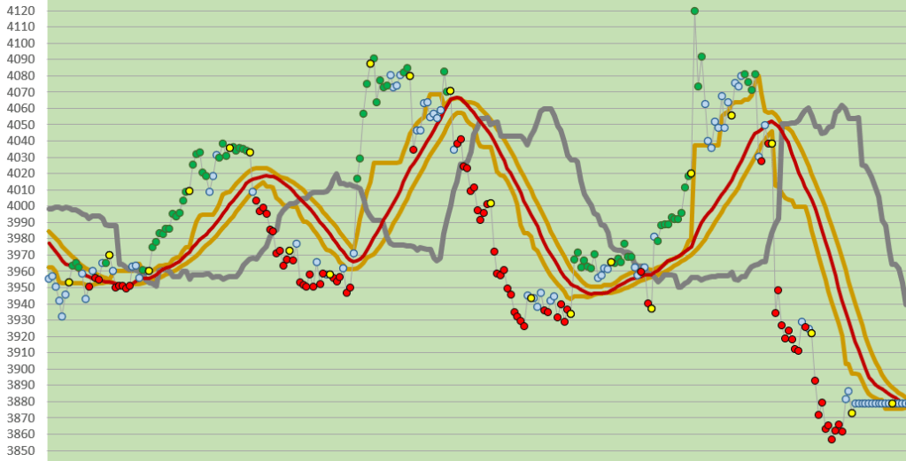
Here’s a picture from our Monte Carlo Trade Simulator after running 2500 iterations:

clip_image003.jpg

These are the results from studying trades from ONE CONTRACT emini S&P 500.

Out of 2500 shufflings of our original trades (wins and losses) (which is what Monte Carlo simulations do), we will suffer from the inevitable periods of drawdown.   But, starting with a hypothetical $25,000, what exactly are the chances of this happening?

Here is where Monte Carlo simulations are useful!  Answers to those questions!  The risk of an equity drawdown to $17,500 while trading (which is a 30% drawdown of starting equity) with our system would be 0.3%, which is very low.  Less than 1% !!   From our sample of 62 trades, with approximately 24 trades a year historically yielded these results. As our Excel Monte Carlo simulator demonstrated, the “Ruin” level of drawdown happened only 6 times in 2,500 iterations of the reordering of sequences.

This level of risk is quite low.     We generally prefer a Risk of Ruin (determined by us to be an equity drawdown of 30%) of less than 5%, best to be below 2%.   Our Monte Carlo simulation demonstrates a level of risk below both of those benchmarks.     Theoretically, and based on the Monte Carlo simulation, it is possible that we could trade safely with less money, perhaps 20,000, or 15,000 as start equity.   All we need to do is plug that number into the spreadsheet and see.  Let’s find out:

Second Monte Carlo Test, using $20,000 as start equity.  The results were still quite comfortably within our risk limits.

clip_image002

Let’s go even lower with our start equity amount:  Here is the Third Test, using a start equity amount of $15,000.    It looks like this:

clip_image003

Still our risk of ruin (30% drawdown in Start Equity) is only 3.5% in our Monte Carlo trade simulations, and still our risk of a possible Peak-to-Valley drawdown of as much as $10,000 is low at only 0.5% .  This satisfies our own important criteria for risk aversion.  We can conclude that statistically, our chances of being wiped out are very low, and that we can start trading with $15,000 allocated to each single contract (trading the emini S&P 500).     Without a Monte Carlo simulator we would not know this.

We’d like to make a distinction in drawdown types.   (Yes, there are a couple different types of drawdown.)

The first type of drawdown is the Peak to Valley drawdowns that occur over the course of your trading activities.   One week you’re at a high point in your ever-growing equity curve, and the next week you’re in a valley after suffering a single serious loss, or more likely, a series of losses over time.  These are the drawdowns that are colored in light yellow and pink, above in the tables from our simulator.

In our experience, it is rare not to have drawdowns of $5000, $7,500, and even $10,000 upon occasion, and the table tells you how frequently this occurs in simulations on a percentage probability basis.  When evaluating a system, this is a secondary level of risk for us, and we like to look for systems that experience $10,000 drawdowns (from peak to valley) infrequently.    Remember, these results are calculated for a 1 contract only simulation.   A $10,000 drawdown with 1 contract is one thing, but when 4 or 6 contracts are on the table, that can create some anxiety.

The second type of drawdown is the one that hits your starting equity.   This is called “Under Water Drawdown”, for lack of a better term.  A drawdown below the starting equity level.   This is much more serious, and is most likely to happen in the beginning weeks or months of your trading when your accumulated equity cushion is not as high as you’d like it to be.   This is the one that is most serious, because it is the drawdown that will wipe you out.   You have to maintain enough capital to trade again, trade again, trade again!

So, it looks like from an analysis of 2500 random sequences, the statistics are on our side!   We have enough starting equity to ensure little or no risk of ruin (statistically speaking, that is!)   If we started with less money, then our Risk of Ruin and the peak-to-valley drawdowns would be greater over all.

Remember, in trading, anything is possible, but with mathematics (or a Monte Carlo simulation of your trading numbers) on your side, you will be able to estimate the probability of your being ruined by a series of losing trades.

We find that the ability to perform a Monte Carlo simulation on a sample of any of our trading systems is an absolutely essential and crucial concept for our trading. There is never a perfect defense in the world of trading, but having a better understanding of your risk of being ruined is a good start!

So, here is an easy to build Excel version of Monte Carlo simulation (without macros) (and without VBA).  If you follow these steps, you will have a simple but effective MC simulator, which will be able to re-order your trades with the push of a computer keyboard button (F9).  And it will show you drawdown levels and peaks, too.  You can add as many features as you wish, such as a method of tracking losses-in-a-row.

How to make a Monte Carlo simulation in Excel follows, in step by step description.   THIS IS HOW TO CREATE IT YOURSELF. 

Here is a step by step description of how to build your own NO MACROS Monte Carlo Simulation worksheet.  (In the descriptions that follow for cell formulas please note that when you put the formulas in the cell, you do not include the quotation marks.)

1. Column A is blank

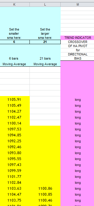
2. Column B will be numbered from 1 to however many trades you have.   Call this column “original trade #”.

3. In column C, paste your trade list (your wins and losses) in a list in any order.

4. call that column “original trade list”.

5. Next column to the right, which is column D, is blank.

6. Next column to the right is column E, named “RAND”, and is filled from the first cell downward with “= RAND ( )” as the cell value.  So, Cell E3 is “=RAND( )”.

7. Next column to the right, which is column F, named “RANK”.  The formula for cell F3 is “=RANK(E3, E$3:E$71)

8. Next column to the right, which is column G, named “Shuffled trd list”.   The formula for cell G3 is “=VLOOKUP(F3, B$3:C$71,2).    All the cells below G3 use the same formula too.

It will look like this:

§ clip_image004Next column to the right, which is column H, named “cumulative equity”.  Begin this column in cell H3 with this formula:   “=$J$1+G3″   Now, the next cell below this, which is cell H4, has a different and unique formula and you should enter cell H4 with this: “=G4+H3″.    All the cells below this use this formula also.

§ Next column to the right, which is column I, named “troughs”.  The formula in cell I 3 should be “=$J$1”.   And to make sure that this formula works ( ! ), be sure to enter the Start Equity amount in cell J1, above J3.        Let’s turn to the cell below J3 now, which is cell J4.

§  Cell J4 has a different and unique formula which is the following:         =IF(AND(H4>H3, H4>=H5, H4>J3), H4, J3)

clip_image005

§ Next column to the right is column K, and is named “sim DD $”.  This is the column where your drawdown in $ amounts will show up.   Cell K3’s formula is: “=IF(ISNUMBER(I3), J3-I3,0)”

§ Next column to the right is column L, and named “sim DD %”.  The formula for cell L3 is:  ” =IF((K3/J3)>0,K3/J3,0)”

clip_image006

The end result of these step by step directions is this, and here’s how it should look:

clip_image007

§     Make sure you have the correct formulas in row 3 and row 4, because some of the cells in row 4 are different from those in row 3.

§   You are almost finished!     Pull all the rows down from row 4 down far enough to include all of your potential trades.

Paste your trades into column C, beginning at row 3, and make sure that all the columns to the right of your last trade at the bottom do not extend down below that last trade’s row.

§   IMPORTANT:   Since you are the builder of this Excel spreadsheet, you’ll need to complete it on your own, and provide column totals, at the bottom below the last row, (the equity curve begins at the top in column H and extends downward to the end where your last trade is seen.)

This is what the last rows (the bottom) of your Monte Carlo Performance Analysis spreadsheet can look like, after you enter the appropriate formulas for Sums in each appropriate column:

clip_image008

The next step:   With all of your trade records entered into this spreadsheet, you will be able to shuffle the order of the trades instantly!   THERE ARE NO MACROS INVOLVED WITH THIS EXCEL MONTE CARLO SIMULATOR.   Calculations are performed with the F9 button, where you have single iterations one after another.  You’ll probably want to see how your system performs in 5 simulations, boom, boom, boom.   See how you do with 10. By altering your basic start equity, you can change your risk parameters.  IT IS A STARTING POINT FOR YOUR TAKING CONTROL OF YOUR RISK.

With each calculation, you’ll have the same ending equity levels (since you are always using the same trades, just in different order), and you can see what your drawdown is, and what peaks and valleys in your equity level to expect.   You will need to do many iterations to get a sense of what your Risk of Ruin is.

We recommend that you create a chart, insert it on top of this spreadsheet in a small corner, and attach it to your equity column values in column H.   This way you can get a new chart generated with every iteration, when you press F9, ,and you can see how your equity curve changes during the course of a trading campaign.

clip_image009

Realistically, what you can learn from this exercise, beyond the building of it, is whether or not you have a sound trading system.  But this Excel Monte Carlo shuffler-of-trades only goes so far.

Most significantly, you can only perform one iteration at a time, unless you add a more sophisticated control system in the form of a macro by using VBA (Visual Basic for Applications).

That’s when you can extrapolate your Risk of Ruin after 2500 simulations!  Or 10,000!  Have fun!

IF YOU JUST WANT THE EXAMPLE GIVEN TO YOU,

you may download it below:

here is a Monte Carlo Excel Spreadsheet—it has MACROS-  this will perform 2500 simulations at the push of a button.  Two worksheets with the same calculations, one arranged horizontally and the other vertically.  Enjoy

put link here <—(NOT AVAILABLE AT THIS TIME) this has MACROS for running 2500 simulations.   There is no spreadsheet available as an example for downloading at this time. 

Helpful Hint:   There is a trading related website which has a Monte Carlo spreadsheet, and many other very good resources.   Please visit this website at this web address:    

https://kjtradingsystems.com/articles.html

Heiken Ashi for Trend Direction with Excel

Using Microsoft Excel as a Primary Trading Tool

We use the Heiken Ashi for trend direction, with Excel calculations, because Emini trading requires new ways of looking at price information, and that’s what Heiken Ashi does.     Using a Heiken Ashi formulation for your price bars will help to diminish much of the “noise” or volatility that you would see with normal Open, High, Low, Close bars.

This is one way to determine the market direction or trend.   (Remember, we are short/medium term trend traders, using intra-day 35 Minute price bars, which means we trade often but are not day-traders.)

Here are directions for setting up an Excel example yourself:                                                               (the actual Excel file is at the end, to download).  

Heiken Ashi will be abbreviated to HA from now on.  In Excel, start with 5 columns, Col A, Col B, Col C, Col D, Col E, in which you place your normal Date, Open, High, Low, and Close values.  Then, in the next 5 columns to the right, Col F,Col G, Col H, Col I, Col J, create your HA formulations to create Heiken Ashi bars in this manner, specifically as HA Open, HA High, HA Low, HA Close, and Pivot HA.

The first (topmost) HA row (in Col F, Col G, Col H, Col I, Col J) is the same as the normal Open, High, Low, and Close.

Below that, in the second HA row, Start with the HA Close, in Column I, calculated as  (Open + High + Low + Close)/4

Col F:   HA Open=(PreviousHAOpen + Previous HA Close)/2

Col G: HA High = MAX(High, HA Open, HA Close)

Col H: HA Low = MIN(Low, HA Open, HA Close)

Col I: HA Close = (Open + High + Low + Close)/4

Col J: Pivot HA = (HA Open + HA High + HA Low + HA Close)/4

Your first goal is to arrive at HA price bar values and then calculate the Pivot HA.  With the Pivot HA, the second goal becomes the calculation of moving averages of the Pivot.  This gives you your primary “long”, or primary “short” direction signal.  This is how you can determine your Directional Bias.

We prefer using 2 moving averages of the Pivot HA as a crossover to determine Primary Trade Direction.

Column M (above) is your TREND DIRECTION.

Remember, we use 12-bars-a-day (35 Minute bars), and this method of finding the trend can be the basis of your Primary Trend Direction trades.

Here is an Excel file which demonstrates (no macros, no VBA):

WANT TO SMOOTH YOUR HEIKEN ASHI with Excel? See our Sept. 2022 post.

Please see our archives for more free downloads of OTHER METHODS OF TREND DETECTION, such as DOUBLE SMOOTHING YOUR HEIKEN ASHI, how to create EMA WAVES, and how to create KAMA (Kaufmann’s Adaptive Moving Average). These are also good ways to detect and follow trends.

and Good Luck with your trading!

contact us at:

therivertradingsystem@gmail.com

How to evaluate your trading system- elementary

How to evaluate a trading system and its performance.

Here is a simple Excel spreadsheet which demonstrates the most basic statistical calculations for Trading Performance evaluation.   It is a good place to start, but only tells you the most elemental of facts……whether or not you have a usable trading system.

Excel example here……….(no macros, no VBA)

Next, here is an evaluation spreadsheet in Excel, which is more detailed than the previous one: It is a trade evaluation, part 2: ……(no macros, no VBA).

Here is what is demonstrated in the spreadsheet example……

Note:  ABS means absolute value or positive value of.

Trades…a list of trades in points, to use in the calculations.

Number of Trades… you can’t get a meaningful analysis of a trading strategy unless you have approximately 30 trades.   Minimum.

Average Winning Trade (Sum of all positive trades/#of positive trades)

Average Loss  (Add up all your losing trades and divide them by total number of losing trades)

Win Percent = # winning trades/ total # of trades.  We believe that the higher win percents are the best, but many useful trading systems have win percents below 50%, most notably the Turtles type long-term trend followers.    All of our systems trade in the win percent of 60% +, and we use strategic exits to ensure even higher win percent (such as Maximum Favorable Excursion exits).

Profit Factor (PF) = (sum of all winning trades/ ABS(sum of all losing trades)).   We look for the highest numbers here, since anything over 1.00 is desireable, but in our experience 1.5 and higher indicates a better system.    We prefer to use the Pessimistic Return Ratio (PRR) rather than the Profit Factor (PF), as it weighs the number of trades as well (which the PF doesn’t).  Please see our Pessimistic Return Ratio post.

Payoff Ratio (also called Win/ Loss Ratio) = Avg Win/ ABS(Avg Loss)

Performance Ratio (from Sunny Harris) = (Payoff Ratio * Profit Factor)* Win Percent.  The Performance Ratio (called the CPC, or Cardinal Profitability Constructs now by its author, Sunny Harris),  is a simple way of telling if you  have a workable system at the beginning of development.  If it is not over 1.20, then you don’t have a usable system.   Note:  most good systems have much higher numbers than 1.20.   So, in our opinion, Performance Ratio is a very low threshold to overcome and we still use it because it was of benefit to us at an earlier point in time.

Drawdown:  this metric was not covered in the Excel demonstration.  It is not included in the spreadsheet above.  But we always follow and calculate drawdown (by which we mean closed trade drawdown) in our spreadsheets, for each trading system/ strategy.  You should also.

Expectation or Expectancy = (Avg win * Win Percent)/(ABS(Avg Loss) * (1- Win Percent)).   Note: you would like to have, at the very least, a positive expectation, otherwise you’ve got a losing system.   Can you lose money with a positive expectation?  Yes, you can, but over time and with patience and persistence, you will profit.

Just as an aside, Van Tharp has a slightly different method of calculating expectation.

All of these metrics, the Win Percent, Expectation, Profit Factor, Payoff Ratio, and Performance Ratio are demonstrated in the link above, in Excel, with calculations shown.

NOTE:  All metrics for evaluating your trading strategy are important to some extent, and we may not have included ones that you like and use, too.  But there are other metrics, and each trader must begin to get a sense of which analysis tools are their favorites, and which ones are most useful to them.  This ability to hone in on which evaluation tools are the most importand and useful comes with time, and also as a result of comparing trading systems to each other.  A trading system by itself has no ranking or valuation;  its worth must be held up and compared to others, and over time!

Also, please see our Risk of Ruin post, available in the Archives. You cannot trade for any period of time without knowing this about your system.

Also, for added precision, how about a Monte Carlo simulator!   See our post!

Good luck with your trading!

contact us here:

therivertradingsystem@gmail.com

First Steps To A Winning System

eMini Trading System– First Steps– how to

Let’s take a moment to lay out a sequential description of how to build a trading system.

We will provide our own answers, and you can supplement or adjust or ignore, if you wish.  (or contact us). Our discussion comes from 20 years of exploration in this area.

CHECK LIST TO ASK YOURSELF

A.  General: choose market (we focus on ONE market to trade only, the eMini S&P).  What data provider (eSignal).  What platform (Excel).  What brokerage (Options Xpress, Interactive Brokers).

B. The System:  1.  Predictive (no), or 2.  following (yes, short to medium term trend following).

3.  Type of price data, EOD (end of day price data)?  NO.

Intraday price data ? (yes, intraday data, using 12 equal bars each full trading day of 6.75 hours (6:30 a.m. PST to 1:15 p.m. PST) (please adjust for other time zones).

(35 Minute price bars).

The practical application of these instructions for daily data collection means that you must enter price data into your spreadsheet at 7:05 a.m. PST (end of first bar time period), again at 7:40 a.m. (end of second bar time period), and then the price data from the third bar at 8:15. And so on, until knocking off at 1:15 p.m. PST.  Only 12 data collection times, with 11 of them during the trading day, and the last at or after the Close.  This can all be accomplished easily with e-Signal Interval Tabular Price data, and an Excel spreadsheet (see image above).

4.  Determine a direction-based entry signal.  

We have found, for our time frame of 35 minute price data, that a 29 period s.m.a. of the CLOSE, or a 29 period KAMA of the close, most accurately gives us a direction-based entry signal. Above is “long” and Below is “short”.

Explanation of Chart: Dark red line (ABOVE) is the 29 bar s.m.a., pale red line is its smoothed self. Orange dots are end of day closing price. This is the primary tool that we use to determine the direction of the emini S&P.

As you can see, from the example above, that this is not always simple-as-pie, right?

Please see our other posts for additional tools to use with your Excel spreadsheets.

Good luck with your trading!

contact us at:

therivertradingsystem@gmail.com

A visual Excel trading system

Simple Trading With Excel

How to tell which way the market is trending: Our Way

There are LOTS OF WAYS to visualize the emini-S&P and help with trading direction.

The easiest way is to use a line chart, not a candlestick chart. Not a bar chart. What is a line chart?

METHOD FOR DETERMINING TREND IN REAL TIME–NOT AFTER THE FACT

This (above) shows you the short term trend. And can be used to determine the long term trend if more price data is available. BUT……….

Our best visual system is described here:

A much more reliable VISUAL TRADING SYSTEM uses 35 minute price data, 29 bar s.m.a., and a longer term moving average to determine the overall Trend. You can use exponential moving averages if you wish.

The rules for the VISUAL TRADING SYSTEM are as follows: if prices are above the 60 bar moving average, just trade above the 29 bar s.m.a. (be long).

And if prices are below the long term moving average, just trade below the 29 bar s.m.a. (be short).

If prices are between the 29 bar s.m.a. and the long term s.m.a., then be “out”, or “neutral”.

This system has been validated as described, over the course of 4 + years with the emini S&P. It works over and over again. Put it on an Excel spreadsheet. You must see it to believe it, and then trade it to profit from it. It is very reliable.

Also, here is the Guppy Multiple Moving Averages visual chart with our colored momentum dots (which replace the need for stochastic charts and/or RSI charts). Very helpful.

Below, is our more recent visual system. The brick red line is the 29 bar moving average of the close. The Gray colored line is the Span A of conventional Ichimoku calculation. We have found it to be helpful in confirming the Trend, which gives us “permission” to enter in a trade direction, either long or short.

All of our charts are made with our 35 minute closing prices from eSignal, which are hand entered into an Excel Spreadsheet of course.

Please notice how we show the price momentum with Trend Strength Dots. In the charts above it is clear from the color of the dot that the trend strength (or momentum) is either bullish (green), neutral (light blue), or bearish (red). Very helpful for trading!

Think of exiting a trade when the momentum becomes “neutral”. Or, think of adding on to a trade when in a trend if the price momentum becomes “neutral”.

Please see our Trend Strength Dots post which helps to explain what these are and how to construct them in an Excel spreadsheet.

Please see our other archives. Good luck with your trading!

contact us at:

therivertradingsystem@gmail.com

Eminiways: trading with 35 minute data.

“The most important predictor of happiness is earned success.”

Simple Trading With Excel.

We use Microsoft Excel as a Primary Tool to trade with.

Our method of trading is simple. We trade only one market (the emini S&P or the micro emini S&P). We use Microsoft Excel to provide us with visual signals and trend confirmations, and momentum indicators.

We trade using 35 minute bar data from e-Signal. (We use the “tabular data” on eSignal as a data source.) That data is recorded in an Excel spreadsheet in a timely manner, calculations are updated, and trades are entered and exited through Interactive Brokers when appropriate called for at the 35 minute intervals on our spreadsheet during the days and weeks of market activity.

On average, we trade about 5-8 times a month, and do hold trades overnight. At times during the last 4 years, the volatility has gotten so unruly that we were forced to NOT hold trades overnight (as a risk management choice). But before that and up to the present time, except during times of extreme volatility, we hold trades overnight.

Please see our ARCHIVES. And note the visual nature of our posts. Those are the tools that we use daily.

contact us at:

therivertradingsystem@gmail.com