Using Microsoft Excel to Visualize Price Patterns
Simple Trading With Excel.
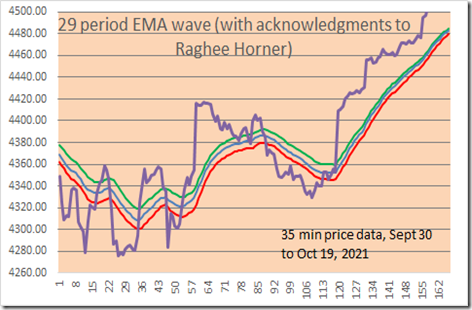
Here is a LINE CHART with 29 period EMA bands. We show 35 minute price data, with 29 EMA of High (green line), 29 EMA of Close (blue line), 29 EMA of Low (red line). Note: with the Excel file, you can change the EMA period if you wish, and the price data of course, and also change the colors it you wish (in your own Excel file which you can DOWNLOAD below at the bottom of the page.)
35 minute Emini S&P price data shown in all charts, for the December 2021 contract.
HOW TO MAKE THE ABOVE CHART MORE USEFUL FOR TRADING?
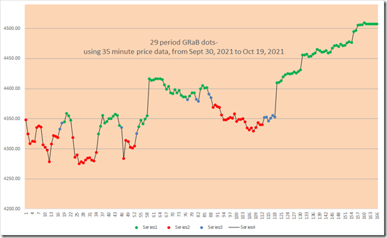
FIRST, CONVERT EACH PRICE POINT (the 35 minute closing prices) INTO A COLOR DOT, BASED UPON above the EMA lines, below the EMA lines, or between the EMA lines. Here are the color dots, green, red, blue:
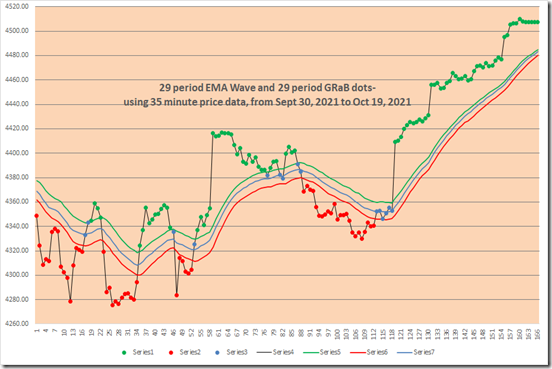
AND see below, put it all together and THIS IS WHAT A CHART LOOKS LIKE WITH THE COLOR DOTS AND THE EMA WAVE lines: Much better and easier to use, we think!
Note how green dots are ABOVE the EMA wave, red dots are BELOW the EMA wave, and blue dots are BETWEEN the EMA wave lines?
As an example of a simple trading strategy, you could Trade Long with green dots, Trade Short with red dots, and be Neutral or OUT with blue dots.
on next line- EMA waves Excel file below for download- click on “29 bar EMA waves” below (no macros, and no VBA code)
(DOWNLOAD is above)
Note: the original ideas for the EMA waves come from Raghee Horner in her book on Forex trading ( 1997 ?) . She prefers to use the 34 bar EMA wave, and instead of dots she prefers to use Candle Stick bars with distinctive colors (red, blue, green). Since we are not able to do the same thing with Microsoft Excel spreadsheets, this is our solution for the time being. The key attribute of either method is better VISIBILITY/ VISUALIZATION of trends.
Good luck with your trading!
Please view our archives for a wide variety of Excel related and trading related information.
therivertradingsystem@gmail.com


