Simple Trading With Excel
How to tell which way the market is trending: Our Way
There are LOTS OF WAYS to visualize the emini-S&P and help with trading direction.
The easiest way is to use a line chart, not a candlestick chart. Not a bar chart. What is a line chart?
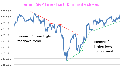
METHOD FOR DETERMINING TREND IN REAL TIME–NOT AFTER THE FACT
This (above) shows you the short term trend. And can be used to determine the long term trend if more price data is available. BUT……….
Our best visual system is described here:
A much more reliable VISUAL TRADING SYSTEM uses 35 minute price data, 29 bar s.m.a., and a longer term moving average to determine the overall Trend. You can use exponential moving averages if you wish.
The rules for the VISUAL TRADING SYSTEM are as follows: if prices are above the 60 bar moving average, just trade above the 29 bar s.m.a. (be long).
And if prices are below the long term moving average, just trade below the 29 bar s.m.a. (be short).
If prices are between the 29 bar s.m.a. and the long term s.m.a., then be “out”, or “neutral”.
This system has been validated as described, over the course of 4 + years with the emini S&P. It works over and over again. Put it on an Excel spreadsheet. You must see it to believe it, and then trade it to profit from it. It is very reliable.
Also, here is the Guppy Multiple Moving Averages visual chart with our colored momentum dots (which replace the need for stochastic charts and/or RSI charts). Very helpful.

Below, is our more recent visual system. The brick red line is the 29 bar moving average of the close. The Gray colored line is the Span A of conventional Ichimoku calculation. We have found it to be helpful in confirming the Trend, which gives us “permission” to enter in a trade direction, either long or short.
All of our charts are made with our 35 minute closing prices from eSignal, which are hand entered into an Excel Spreadsheet of course.
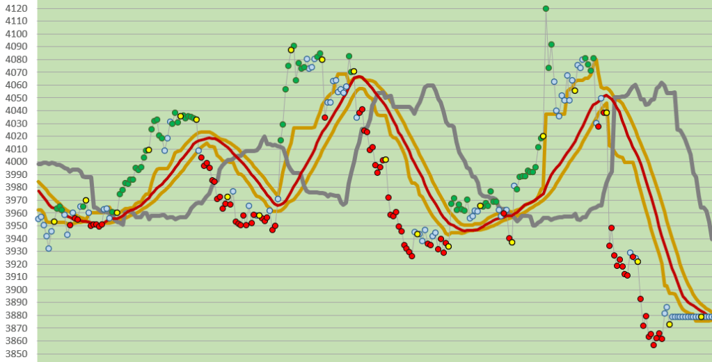
Please notice how we show the price momentum with Trend Strength Dots. In the charts above it is clear from the color of the dot that the trend strength (or momentum) is either bullish (green), neutral (light blue), or bearish (red). Very helpful for trading!
Think of exiting a trade when the momentum becomes “neutral”. Or, think of adding on to a trade when in a trend if the price momentum becomes “neutral”.
Please see our Trend Strength Dots post which helps to explain what these are and how to construct them in an Excel spreadsheet.
Please see our other archives. Good luck with your trading!
contact us at:
therivertradingsystem@gmail.com
